NYRA Studio
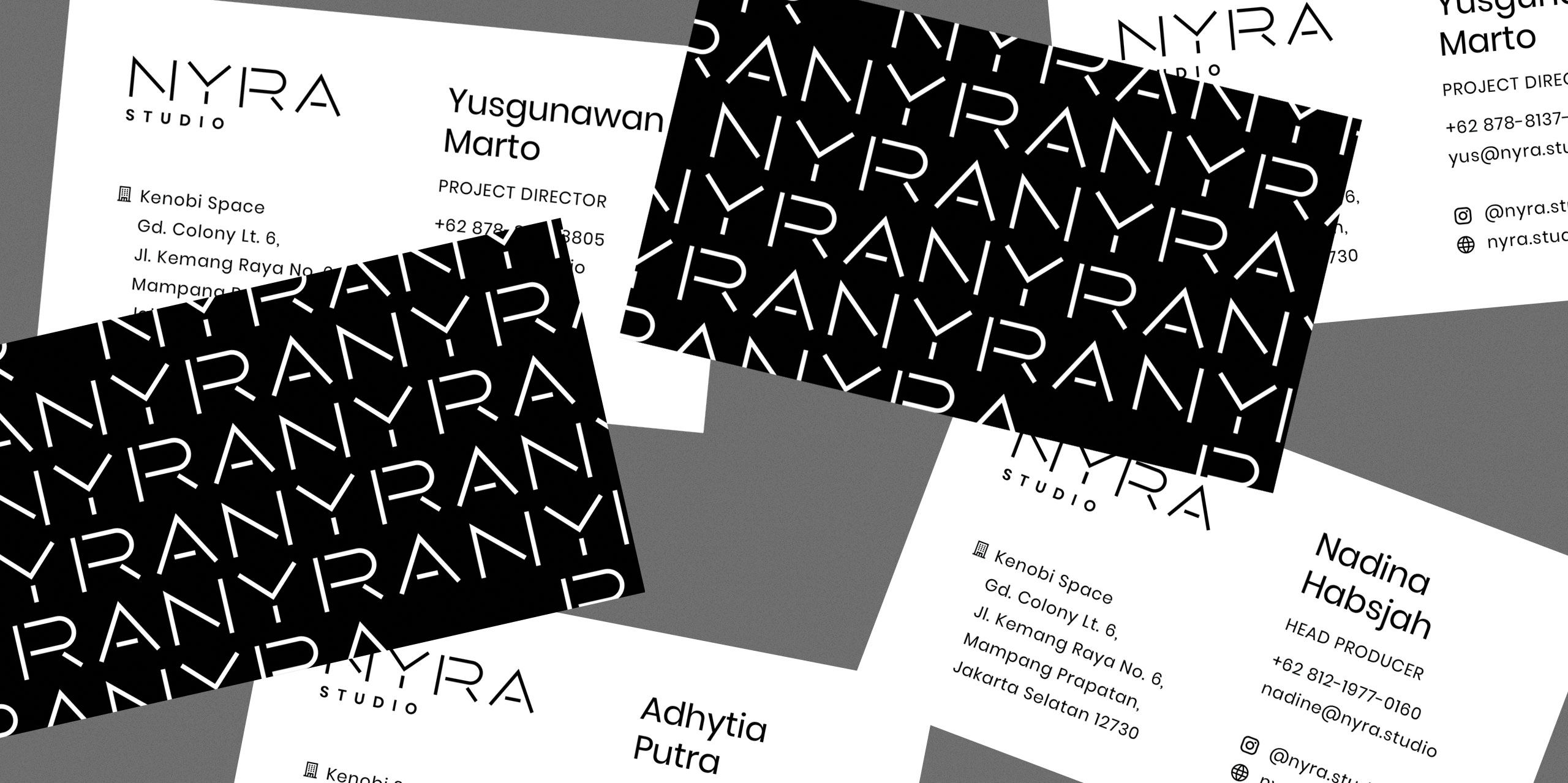
Brand identityDesigned the main visual identity components for an upstart production company based in Jakarta, Indonesia. Considering that their branding will mostly appear within a video or an interactive format, the logotype had to be alive through flexible executions within a simple design system.
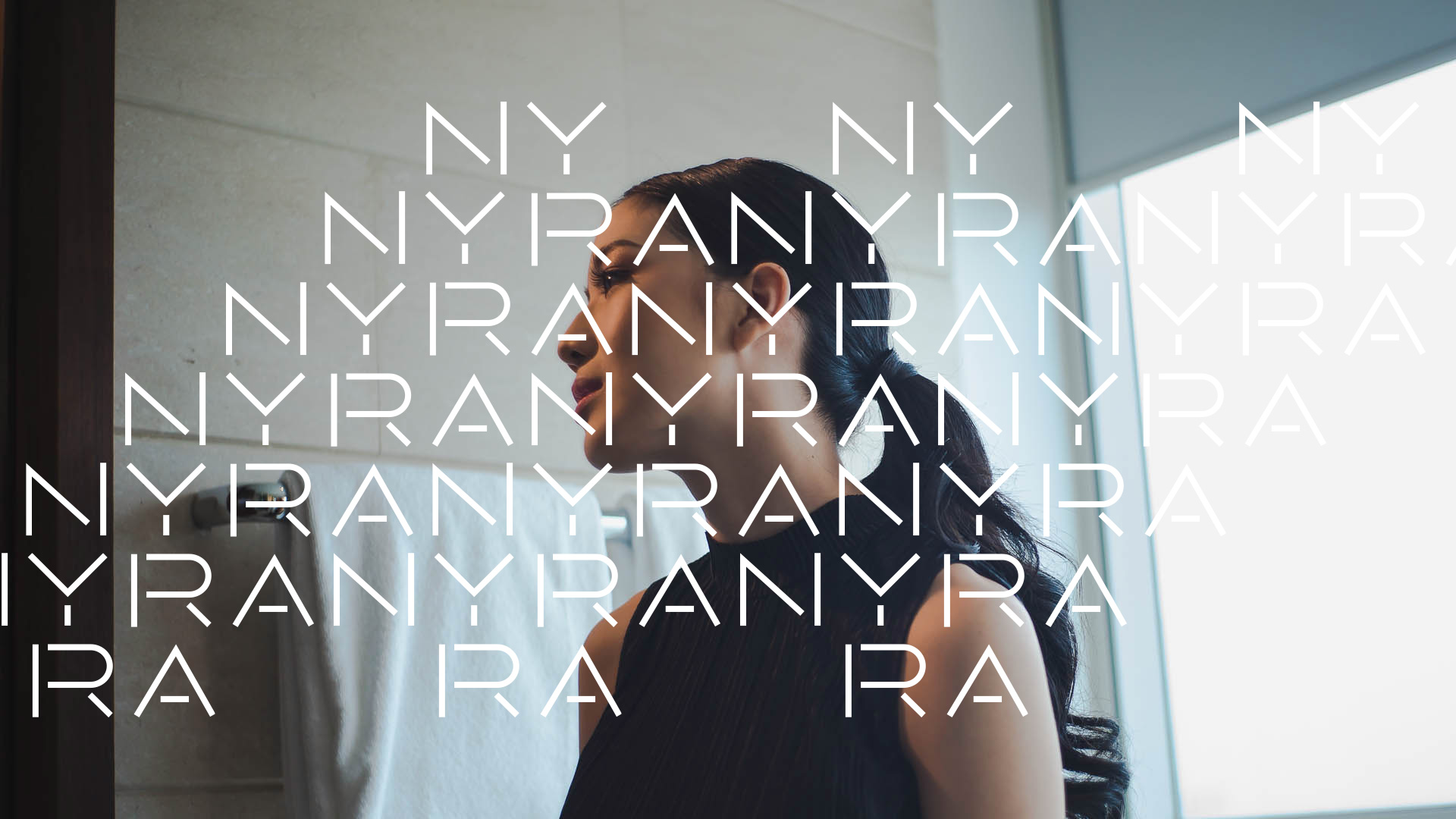
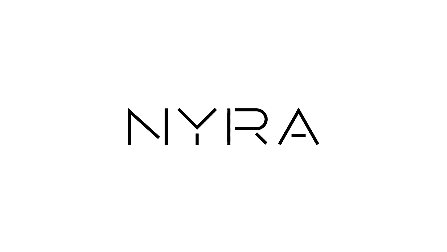
The base wordmark design started with custom typography. In making the type monospaced, each letter is easy to stack and place around an imaginary grid.
The approach was inspired by how the combination of different elements creates new meaning outside of themselves. Working like a set of building blocks, the NYRA logotype is made of different shapes to spell out the brand name.

Making the shapes feel like confetti, with a base color palette of cool pastels, adds a fun, celebratory feel. The shapes set is used an accent element for select branding materials.

The direction to create custom monospaced type is also reflective of the name NYRA being an acronym of the founders’ first names. This meant that no letter should be more visually prominent over another.